
Truth Be Told
Hypothetical Client
Truth be Told is an Austin, TX based nonprofit providing transformational programming to women who are or have been incarcerated.
Goal
To create a website that would help Truth Be Told grow as a non-profit and grow partnerships.
Category
Website
UX Team
Eli Dagostino
Tiffany Liu
Tim Meyer
Duration
Two weeks
Contextual inquiry: four users

Who are these pages speaking to? There was a general confusion…
“Maybe the prison systems?”
“I think this page is meant for the people running the programs.”
“This page is talking to non-inmates.”
“This page could be talking to potential donors.”
We asked them: Who else could these programs benefit? They had some great ideas!
“Teenagers in broken homes... Foster children!”
“These programs could really benefit anyone struggling to get out of a difficult situation.”
“The homeless or addicts.”
Interviews: nine users
Key assumption: organizers from other nonprofits would be the adopters of Truth Be Told’s programming, which would in turn grow TBT’s initiative
Key finding: nonprofits can’t program without their high net worth donors, so, in addition to speaking to other nonprofit organizers who may adopt TBT’s programing, TBT’s websites must speak directly to donors
Non-profit professionals

High net worth donors

“80% of your money comes from 20% of your donors.”
We believed that other non-profit organizations would be the adopters of Truth Be Told’s programming. We first interviewed:
2 nonprofit executive directors
4 nonprofit program coordinators
We learned from those six initial interviews that without donors, none of the programming can happen. Our focus shifted to donors. We then interviewed:
3 high net worth donors
Affinity mapping
Key findings:
Donors and nonprofit program coordinators alike appreciate a website with strong visuals and simple interface
Donors and nonprofit program coordinators alike appreciate having the mission, story and some success stories on a website
Donors are critical to a nonprofits ability to grow
Nonprofits are growth minded — always being open to partnerships
Donors judge nonprofits by their board first
Donors look for success metrics
Personas
Molly Baldwin (high net worth donor), primary
Jack Lee (nonprofit programming coordinator), secondary
Problems
Molly Baldwin learned about Truth Be Told through a friend and their mission resonated with her. She is excited about their work but doesn’t have enough information about their mission, story, board, financials and data to make a substantial and well informed donation.
Jack Lee learned about Truth Be Told through his statewide nonprofit network and is interested in potentially collaborating. Jack needs more visuals, stories and data about Truth Be Told’s programming because he is excited about their work but doesn’t think their text-heavy and high-level website will be convincing to his executive director or donors.
Solutions
(Molly) We will redesign Truth Be Told’s navigation scheme to make mission, story, board, financials and growth data more accessible. We will also streamline the website’s ability to accept both small and large donations.
(Jack) We will make Truth Be Told’s mission, story, model and growth data more accessible so they are more presentable to potential collaborators.
Information architecture:
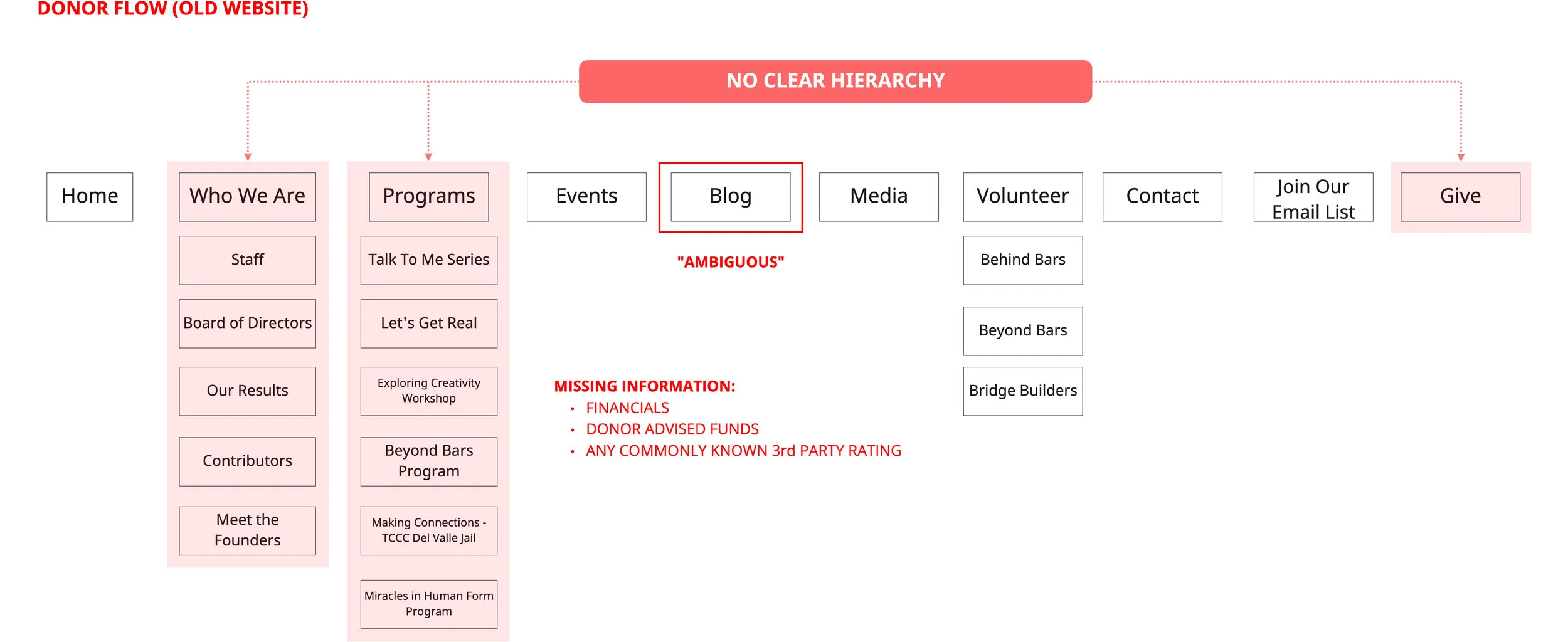
10 global navigation items and 14 supplemental reduced to five global and nine supplemental
Scroll to see IA flows for both Molly and Jack.

Here is the old site map on top and how we rearranged the 10 main menu items into just five below. Two pages were added in response to our research findings.


User flows
Jack Lee, Program Coordinator: Looking for information to share with his board.
Molly Baldwin, Donor: Evaluating the stability and scalability of the mission.
Sketching
A collaborative process, my team and I each sketched each screen and then came together to synthesize.


Lo-fi wireframes


Wireflows


Style Guide: Molly and Jack are driven by visuals, so I was excited to give them a brighter interface to better reflect the vibrance of Truth Be Told’s mission.
Hi-fi wireframes


The Truth Be Told’s homepage from original through ideation to new website.
1 [Donate] We took inspiration from other non-profit websites and included a large donate CTA.
2 [COVID update] We brought the COVID update up to the top of the website.
3 [Video] The video on the existing Truth Be Told homepage was five minutes long. No one watched it and it took up the entire window above the fold.
4 [Images] Visuals were important to them, so we featured a big photograph up top.
5 [Mission] The mission and photographs are below the fold on the existing website. Both Jack and Molly are mission driven, so we put the mission statement front and center.
6 [Programs] Jack wants easy access to programming, so we allotted a large area just above the fold for programs.
7 [Story] Finally, both Jack and Molly are story driven, so a timeline was included to give them a quick peek into Truth Be Told’s history.

Visual appeal is important, but it must be usable and desirable to users…
Usability testing: four users

“I have more confidence in organizations that have beautiful websites and a lot of content showing strategy. The aesthetic is polished and it feels serious.”
“I like that there’s a donate area on the homepage... Saves me a click!”
“I like this high-level overview. [The Model page]”
Usability test results: affinity map
In response to that desire for clarity, we created a dedicated page titled “Who We Serve” which provides more context to the rest of the site.
Next steps
I learned so much about nonprofits during this redesign and have a real appreciation for what these organizations go through to make their programming happen. Next in this redesign, I’d like to:
Desirability Test the UI elements
The style guide was chosen based on research findings and assumptions saying our users liked eye-catching visuals. That said, we didn’t get a lot of feedback on the visuals in our usability tests. UI is very important, and I want to make sure it’s user approved.
Card Sort the navigation
Users were successful in finding everything we wanted them to in our usability tests, but there were so many navigation items on the original site, I want to make sure all of the content a user once had access to was in the place a user would expect it.
Develop a clear voice for for Truth Be Told
Being a hypothetical client, Truth Be Told’s voice isn’t fully developed or calculated. Further user research is needed to perfect the appropriate tone off UX copy.
Collect photographs, videos and more data from Truth Be Told
Conduct A/B Testing
How do people want to be spoken to by TBT? Are they corporate? Warm and friendly? Personal?
Where do people donate? Are they more drawn to the donation page or the CTA on the homepage?
How do people choose to contact TBT? Should the contact page have a single form or multiple?
I thoroughly enjoyed this redesign experience and look forward to my next opportunity to help an organization shine!